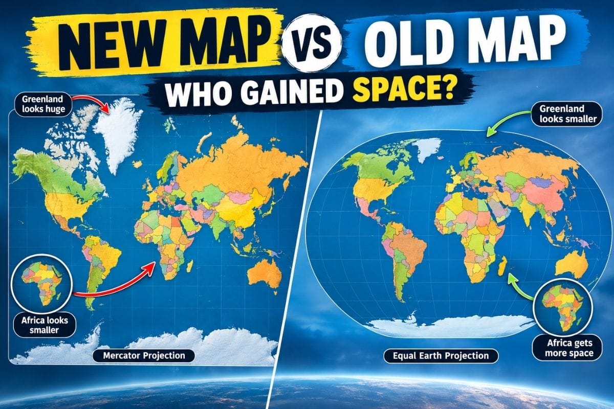
Quick answer: Africa, South America, and other regions near the equator gain the most visible size on an equal-area map. Greenland, Canada, Russia, and northern Europe lose the inflated proportions they carry on a Mercator map.
The familiar world map has shaped how Americans, and plenty of other people, picture the size of countries and continents. But the map has a built-in problem: Earth is round, and the map is flat.
That mismatch creates real distortion.
Gerardus Mercator built his projection in 1569 to help sailors navigate. It keeps angles accurate and makes compass bearings easy to plot, but it stretches land more and more as it approaches the poles.
That’s the reason Greenland can look about the same size as Africa on a standard map, even though Africa is roughly 14 times larger.
The question has come up again in 2026. On September 4, the United Nations General Assembly passed a resolution backing wider use of the Equal Earth projection, a map built to show landmasses at their correct relative size. The vote was 164 in favor, six abstentions, and the United States voted no. The resolution doesn’t force anyone to stop using other maps.
So what actually changes when a Mercator-style map gets swapped for an equal-area one? Here’s a rundown.
- Africa gets the biggest visual correction, showing up much larger next to Europe, Greenland, and North America.
- South America also grows on the page, especially compared with land farther north.
- Greenland shrinks the most, since its high-latitude position causes the worst Mercator distortion.
- Canada, Russia, and northern European countries all look smaller on an equal-area map.
- No projection gets everything right. Equal-area maps keep size accurate but bend shape, distance, or direction to do it.
Why Does the New World Map Look So Different?

Before comparing countries, it helps to know what a projection is actually doing.
A globe shows Earth in three dimensions, the way it actually exists. Flatten that curved surface onto paper, or a screen, and something has to give. Every projection is a choice about what to keep accurate and what to let slide.
Cartographers group projections into a few main types. A conformal projection, like Mercator, preserves angles and local shapes. An equal-area projection protects the true relative size of land and water. Others try to split the difference across several properties at once.
Equal Earth falls into the equal-area category. Tom Patterson, Bojan Šavrič, and Bernhard Jenny built it in 2018 specifically to show countries and continents at their correct proportions.
None of this makes Africa physically bigger or Canada physically smaller. It changes how much room each one takes up on the page.
1. Africa Gains the Most Visual Importance
Africa is the clearest example.
On a standard Mercator map, Africa can look almost modest sitting next to Europe, Greenland, Russia, and North America. On an equal-area world map, its actual size becomes obvious.
Africa covers about 30.3 million square kilometers, the second-largest continent after Asia. That’s roughly 14 times the size of Greenland.
Most of Africa sits close to the equator, and Mercator barely enlarges land there. It’s the poles where the stretching really kicks in.
The Result Flips The Picture
Mercator: Greenland looks enormous; Africa looks smaller than it is.
Equal-area: Africa dominates the map the way its actual land area suggests it should, and Greenland drops way down in size.
This isn’t just a design quirk. Map projections shape how people understand geography without realizing it. National Geographic has pointed out that Mercator maps distort people’s sense of relative size, especially at higher latitudes.
Also Read – What Is the Oldest Country in the World?
2. South America Gains More Visual Space
South America benefits too.
The continent sits mostly in tropical and subtropical latitudes, so it escapes the extreme enlargement that hits land farther from the equator in either direction.
On an equal-area world map, South America looks a lot bigger next to Europe and Greenland than people are used to seeing.
Here’s one comparison that makes it click: National Geographic notes South America is more than eight times the size of Greenland, despite the two looking close to the same size on a Mercator map.
Brazil is a good example on its own. It’s larger by land area than the contiguous United States, but that’s not obvious from most conventional world maps. An equal-area projection makes the comparison much easier to see.
3. India and Other Lower-Latitude Countries Become More Proportional
The shift isn’t limited to whole continents.
Countries closer to the equator lose less apparent size under Mercator. Countries far from it, north or south, get inflated the most.
That means much of South Asia, Southeast Asia, Central Africa, and parts of South America come out looking more proportional next to northern countries.
India doesn’t get physically bigger, obviously. What changes is how it looks next to Russia and Canada on the page.
This matters because most people size up countries by looking at a map, not by checking square-mile figures. A world map gives them a better starting point.
4. Greenland Loses the Most Dramatic Amount of Visual Space
If Africa is the biggest winner, Greenland is the biggest loser.
On a Mercator map, Greenland can look nearly as large as Africa. That’s an illusion created entirely by its position near the Arctic.
For Reference:
Africa is about 14 times larger than Greenland.
South America is more than eight times larger than Greenland.
Greenland’s oversized look on classroom and digital maps is one of the most misleading parts of the whole system. On an equal-area map, it shrinks down to something closer to its real proportional size, which makes the distortion pretty easy to see.
Also Read – What Is the Smallest Country in the World?
5. Canada Shrinks Visually
Canada gets a similar treatment on Mercator maps.
Because so much of the country reaches deep into the Northern Hemisphere, its northern territories pick up a lot of distortion.
Canada is still one of the largest countries on Earth on an equal-area world map. It doesn’t become small. But its size relative to countries nearer the equator becomes far more realistic.
Alaska works the same way. National Geographic points out that Alaska can look enormous on Mercator maps despite having a smaller actual area than Libya.
The equal-area map isn’t taking land away from Canada or Alaska. It’s just removing the inflation the projection added in the first place.
6. Russia Also Loses Some of Its Visual Dominance
Russia is another good example.
The country stretches across some of the highest latitudes on Earth, and that territory gets stretched hard on Mercator-style maps.
Russia stays the largest country in the world no matter which projection you use. But its footprint on the page shrinks considerably under an equal-area projection.
That produces a more balanced picture next to Africa, South America, and southern Asia.
Worth repeating: Russia isn’t smaller on the new map. It’s just being shown without the projection-driven bloat.
7. Northern Europe Also Gives Up Visual Space
The same math hits every high-latitude region.
Iceland, Norway, Sweden, Finland, and other northern countries can look bigger than they actually are next to tropical and subtropical land.
An equal-area map dials that back. Europe ends up taking up less space relative to Africa than a lot of Americans grew up seeing on classroom maps.
That doesn’t make Europe insignificant. It’s just closer to its real proportion.
Why Doesn’t Everyone Simply Use the Equal Earth Map?
Because there’s no perfect flat map of a round planet.
If a map keeps area accurate, something else has to bend. Equal-area projections distort shape and direction. Mercator makes the opposite trade: it gives up accurate area to keep angles true, which is what makes it good for navigation.
Mercator was built for a specific job. Sailors needed reliable bearings, and the projection delivered that.
So calling Mercator a “bad map” misses the point. It’s a map built for one purpose.
USGS still treats Mercator as an important navigational tool, and National Geographic has said different projections suit different jobs.
An equal-area map answers this question well: how large are these countries or continents relative to each other?
Mercator answers a different one: how do I plot a constant compass bearing across a nautical chart?
Also Read – What Is the Most Spoken Language in the World?
Old World Map vs. New World Map: Who Gains and Who Loses?
| Region/Country | Typical Mercator Effect | Equal-Area Effect |
|---|---|---|
| Africa | Visually reduced | Major visual gain |
| South America | Underrepresented next to northern regions | Visual gain |
| India/South Asia | Less exaggerated | More proportional |
| Brazil | Can look smaller than it is | More accurate scale |
| Greenland | Extremely enlarged | Major visual reduction |
| Canada | Enlarged, especially in the north | Reduced visually |
| Russia | Strongly enlarged toward the north | Reduced visually |
| Alaska | Strongly enlarged | Reduced visually |
| Northern Europe | Enlarged | Reduced visually |
The word to hold onto here is visual. The countries haven’t changed. The picture of them has.
Does the New Map Make Geography More Accurate?
For area comparisons, yes.
An equal-area projection is built specifically so relative sizes come out correct. National Geographic notes that these maps preserve true proportions, at the cost of distortion elsewhere.
But “most accurate” isn’t a label that applies across the board. It depends on what’s being measured:
Area: Equal Earth does this well.
Navigation: Mercator still has the edge.
Shape: Some conformal projections do better.
Distance: Specialized projections handle this better than either.
General world visualization: Robinson and Winkel Tripel try to balance several kinds of distortion at once.
National Geographic itself has used different projections for different jobs, including Winkel Tripel for general world maps.
The real lesson isn’t that one map has replaced every other map. It’s that different maps answer different questions.

What Does the 2026 UN Map Decision Actually Mean?
The 2026 vote drew attention because the UN General Assembly backed a resolution supporting wider use of the Equal Earth projection.
Togo led the push, with support from African countries. The final count was 164 in favor, six abstentions, and one vote against, from the United States.
That doesn’t invalidate every Mercator map in existence.
The resolution isn’t legally binding, and Mercator still has real uses, navigation among them. What the UN action does is nudge governments, schools, institutions, and tech companies toward more proportionally accurate maps when they’re communicating global geography.
Why Map Design Matters More Than Most People Realize
Maps aren’t neutral photographs of Earth. Every projection makes choices.
When Greenland keeps showing up looking about the same size as Africa, or northern countries keep visually dominating the tropics, that shapes how people picture the planet in their heads, whether they notice it or not.
National Geographic has described this as part of why people’s mental image of world geography tends to be off.
For students, journalists, teachers, and anyone comparing countries, that gap matters. A good map doesn’t need a perfect coastline. It needs to avoid making a country that’s three times larger than another look smaller, just because it happens to sit near the equator.
Also Read – Think English Is Tough?
Conclusion
Africa and South America come out ahead in the move from a Mercator-style map to an equal-area one, and most lower- and mid-latitude regions gain some accuracy along with them.
Greenland, Canada, Russia, Alaska, and northern Europe lose the most, since Mercator’s high-latitude stretching hits them hardest.
None of this makes one map “right” and the other “wrong.” Mercator was built for navigation and still does that job well. Equal Earth does a better job showing how big places actually are relative to each other.
The map you’re looking at depends on what it was built to preserve. If the goal is understanding true relative size, an equal-area projection gets you there.
Frequently Asked Questions
Is the new world map more accurate than the old map?
For comparing the area of countries and continents, yes. It doesn’t preserve every geographic property equally well, though.
Which country gains the most space on the new world map?
No single country “wins” universally, since it depends on the projection and layout. At the continental level, Africa shows one of the biggest visual gains compared with how it looks on Mercator maps.
Why does Greenland look so large on old world maps?
Greenland sits at a very high northern latitude, and Mercator stretches land more and more as it nears the poles. That’s what inflates its apparent size.
Is Africa really 14 times bigger than Greenland?
Yes. Africa is about 14 times larger by area, even though the two can look close to the same size on a Mercator map.
Does Russia become smaller on the new world map?
Not in reality. Its visual footprint shrinks because so much of the country sits at high northern latitudes, where Mercator distortion is worst.
Is Mercator still used today?
Yes. Mercator and its derivatives are still central to navigation and a lot of digital mapping, since preserving angles and bearings is what makes them useful for that job.
Does the United Nations ban Mercator maps?
No. The 2026 resolution encourages more area-accurate mapping but doesn’t ban Mercator. It’s still useful, especially for navigation.
What is the best map projection for seeing the true size of countries?
An equal-area projection, Equal Earth being a common choice, works best when the goal is comparing actual relative areas.
Why can’t we make one perfect flat world map?
Because Earth is a sphere, and flattening a curved surface always introduces distortion somewhere, whether in size, shape, distance, or direction. A globe handles these relationships in a way a flat map never fully can.
Sources & References
- United Nations — General Assembly: “Correct the Map” Resolution
- United Nations — General Assembly Plenary Transcript
- Associated Press — UN Endorses New World Map
- Equal Earth — Official Projection Website
- Equal Earth — Official World Map
- Equal Earth — Physical World Map